Transit Time site study & redesign
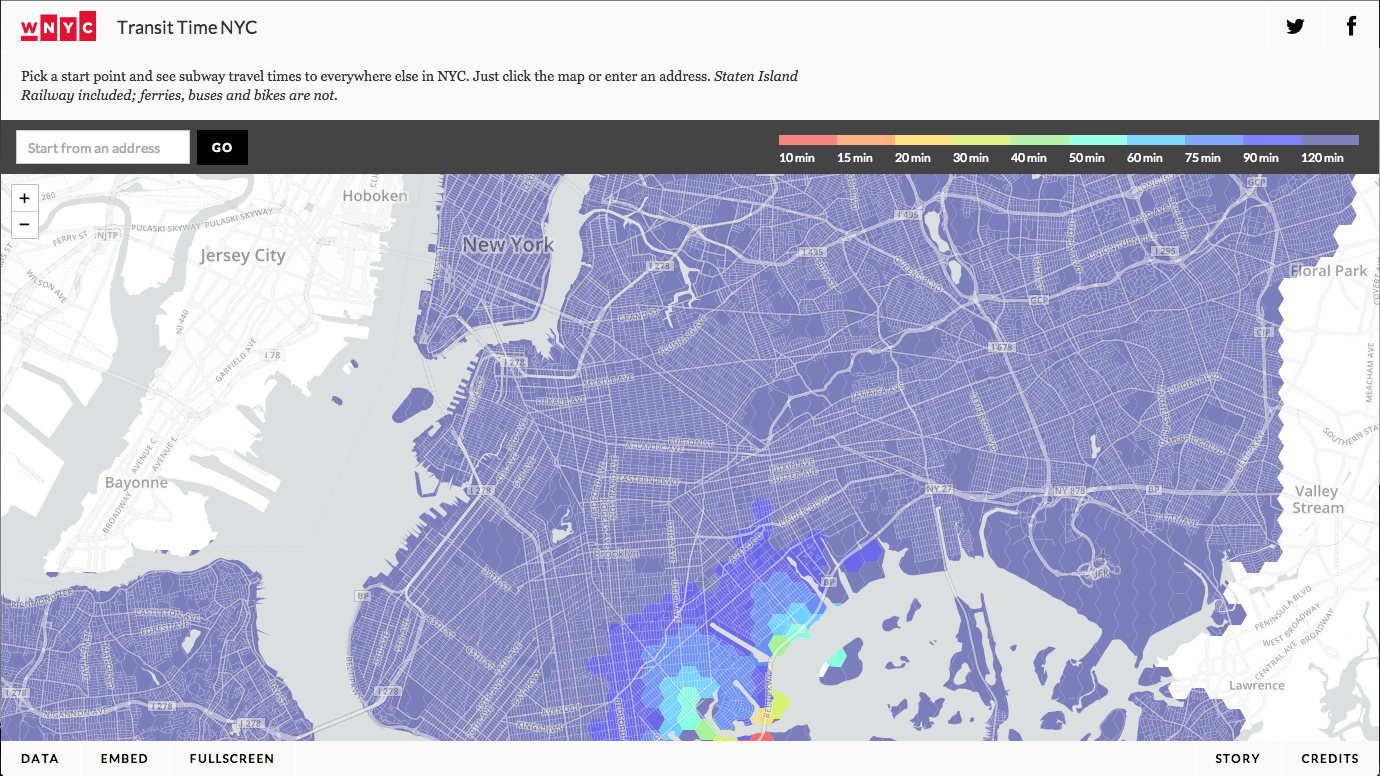
For this assignment, I took a look at WNYC's Transit Time NYC map, which looks like this:
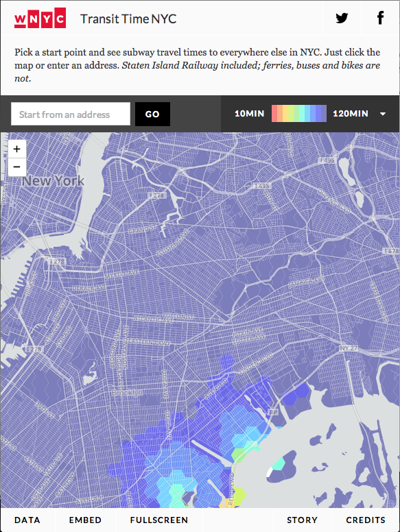
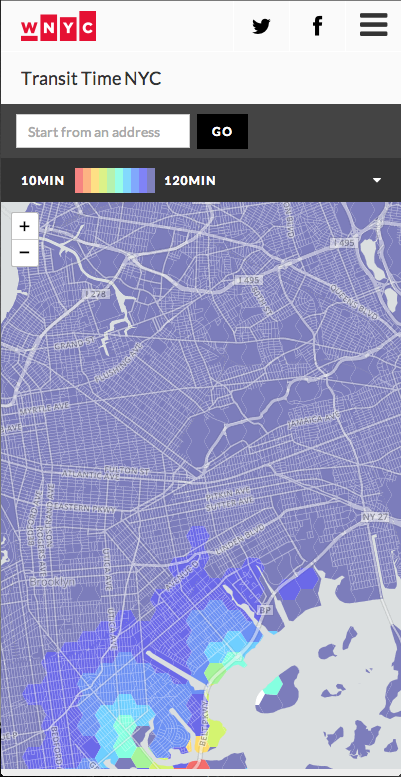
It's a responsively designed page, which scales pretty gracefully to different sizes:
Problems
However, I think its responsive design is problematic in how it hides information-particularly the explanation and the Data/Story/Credits buttons. Data disappears both intentionally (see the narrowest viewport image above) and unintentionally, as illustrated in this in-between size:
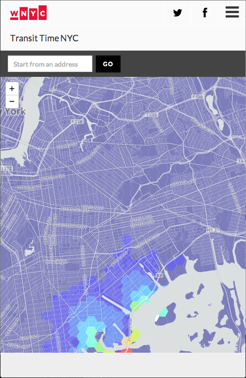
I also think that the multiple title and legend bars at the top take up too much space when the viewport is small. They shrink horizontally but not vertically, save for the reduction made when the intro paragraph is removed.
I also think this page could do with some conceptual rethinking of where different pieces of content (particularly the content hidden behind links/buttons) should go. "Data," "Embed," and "Fullscreen" are in one corner, while "Story" and "Credits" are opposite it. The information that pops up on "Data" actually carries the title "Methods," so for one the button should probably be updated. I would put Methods, Story, and Credits together since they are content/information related, and put Embed and Fullscreen together because they are related to interacting with the page but not with the concepts. Also it would be cool if the Fullscreen button worked (in my install of Chrome, it does not).
Fixes
I focused on fixing the problems I noted in the smallest viewport sizes. Here is the page with my Developer Tools tweaks applied:
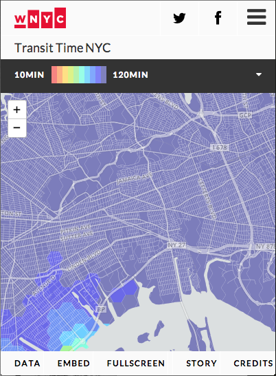
The changes:
- Footer links de-hidden
- Footer links' padding reduced to fit horizontally
- Address input box removed to save space; touch map interface more important on small devices.
- Header padding reduced to save space at top.