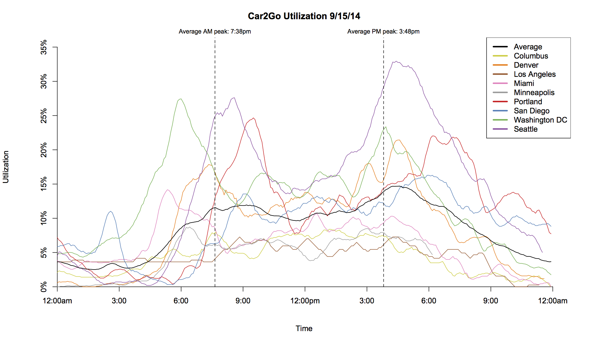
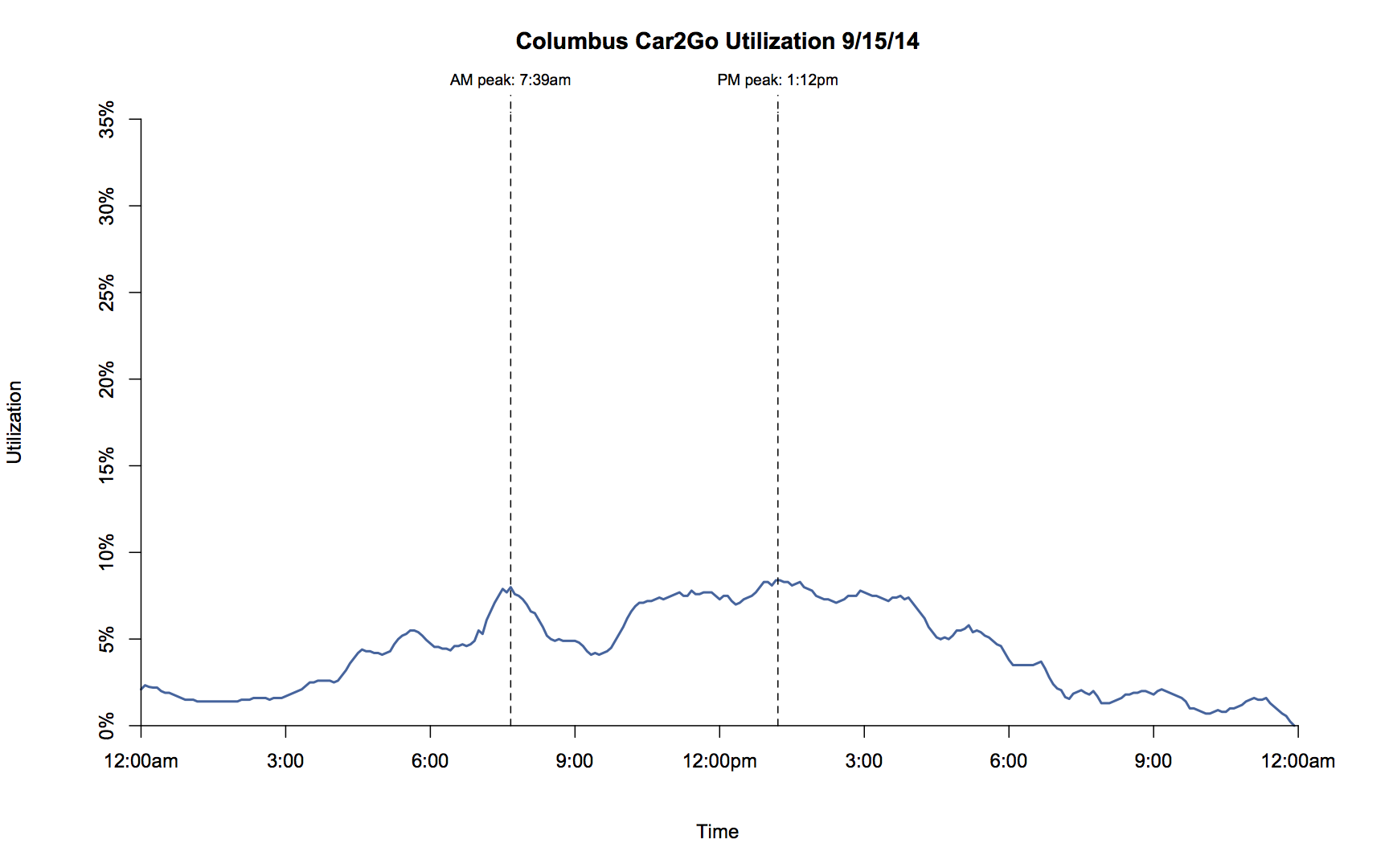
Chart
I wanted to find out when people use car2go, and if the usage patterns caried from city to city. To determine when people are using car2go, I tracked usage of the systems continously, using the excellent API car2go provides. Using this data, I charted usage patterns across the U.S. car2go Cities.
The data shown here is from September 15, 2014, a Monday. The charts show a running average utilization over the 15 minutes before and 15 minutes after the denoted time.
Due to issues with the car2go API, some times are missing data. Individual missing points were interpolated from the two points around them. Larger missing spans are displayed as breaks in the data.
 |
 |
|
|
|
|
|
|
|
Source: Car2Go official API. Data collected, processed, and presented by Lucas Smith.